
The user interface design of a product plays a central role in defining how users experience your brand. With millions of apps, websites, and platforms competing for attention, a sleek and intuitive UI can make or break your product’s success.
So, what exactly is user interface design? Why does it matter so much? And how do you ensure your UI isn’t just good, but exceptional?
In this comprehensive guide, we’ll explore every essential element of UI design, its role in product development, key principles, the difference between UI and UX, and how Enozom delivers outstanding UI design that blends creativity, usability, and technology.
What is User Interface (UI) Design?
User Interface Design is the art and science of designing the visual elements users interact with when using a digital product. This includes screens, buttons, icons, typography, layout, colors, animations, and more. It’s about creating an interface that is not only visually pleasing but also functional, consistent, and intuitive.
Unlike UX design, which focuses on the overall user journey, UI is about crafting what users see and touch—making digital interactions smooth, efficient, and even enjoyable.
Why User Interface Design Matters More Than Ever
Great user interface design is more than aesthetics—it’s about solving problems for users, enhancing product value, and ultimately improving your business outcomes. Here’s why it’s so important:
1. First Impressions Influence Trust
Your UI is often the first thing people see when they encounter your product. Within seconds, they make judgments about your professionalism, reliability, and even security.
An outdated or poorly designed interface can immediately discourage users, even if the underlying functionality is solid. Conversely, a sleek and modern UI can build instant credibility, drawing users in and encouraging them to explore further.
2. Better UI Means Better Usability
A beautiful interface means nothing if users can’t figure out how to use it. UI design ensures that essential tasks—like signing up, making a purchase, or finding information—can be done quickly and smoothly. This not only boosts conversions but also makes your product sticky, meaning users are more likely to return.
3. Supports Engagement and Retention
Great UI design isn’t just usable—it’s delightful. Micro-interactions, intuitive transitions, and personalized elements make your product more engaging. These small touches create an emotional connection, increasing the likelihood that users will stick around, return often, and recommend your product.
4. Improves Accessibility for All Users
UI design also takes into account users with different abilities. Whether it’s choosing readable fonts, ensuring color contrast for those with visual impairments, or optimizing for screen readers, accessibility ensures your product is inclusive—and potentially expands your market reach.
5. Reinforces Your Brand Identity
Consistency in design—fonts, colors, icons, layouts—not only makes your product easier to use, it also reinforces your brand identity. A strong UI reflects your values and voice, leaving a lasting impression on users that goes beyond functionality.
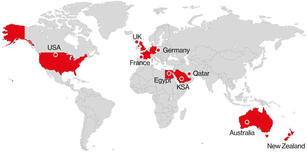
Enozom is a trusted software development partner known for crafting intuitive, scalable, and visually striking digital products. Headquartered in Egypt and serving clients around the world, Enozom combines top-tier design sensibility with engineering excellence to deliver high-performance, user-focused solutions.
What Sets Enozom Apart:
🔄 Full-Service Approach
Enozom supports your entire product lifecycle—from initial concept and user research to wireframing, prototyping, and polished UI implementation. This end-to-end involvement ensures design consistency, technical feasibility, and faster go-to-market timelines.
👥 User-Centric Philosophy
At Enozom, every design choice is driven by real user behavior and needs. Interfaces are crafted to be intuitive and efficient, enhancing user engagement and minimizing friction at every touchpoint.
🌍 Cross-Industry Expertise
With deep experience across sectors like healthtech, fintech, e-commerce, and enterprise platforms, Enozom knows how to create designs that meet both the functional demands and aesthetic expectations of each industry.
⚡ Agile & Transparent Delivery
Enozom follows agile methodologies, allowing for flexibility, frequent iterations, and close collaboration. Clients stay informed and involved throughout the process, with continuous feedback loops ensuring the final product aligns perfectly with goals.
If you’re seeking a reliable UI design and development partner that values user satisfaction, business impact, and beautiful, functional design, Enozom is your go-to team.
Add Your Heading Text Here
Principles of Great User Interface Design
Truly effective user interface design is more than just aesthetics—it’s a strategic process rooted in psychology, usability, and behavior-driven thinking. The following core principles help UI designers create interfaces that are not only beautiful but also practical and intuitive.
1. Clarity
Clarity is the foundation of any successful interface. Users should always understand what each element on the screen does, without having to guess or think too hard. Whether it’s a navigation menu, a call-to-action button, or an icon, its function should be immediately clear.
Designers achieve clarity through simple layouts, readable text, recognizable icons, and consistent design language. The clearer your UI is, the less likely users are to make mistakes or abandon your product out of frustration. Clarity minimizes cognitive load and makes every interaction feel seamless.
2. Consistency
Consistency creates familiarity. When users see the same design elements behave in the same way across your app or website, they develop confidence in how to use it. Inconsistent design—like buttons that change color for no reason or unexpected placement of menus—disorients users and increases the learning curve.
Visual consistency includes using a unified color palette, typography, icon styles, and spacing. Functional consistency ensures similar actions yield predictable results throughout the interface. Together, they make your product feel stable, intuitive, and polished.
3. Feedback
Every action a user takes—clicking a button, filling out a form, uploading a file—should be acknowledged. This is what we call feedback. Feedback can come in many forms: a loading spinner, a success message, a change in button state, or even subtle animations.
Without feedback, users are left wondering if the system received their input or if something went wrong. Feedback reduces anxiety, builds trust, and helps users stay oriented. It’s a simple principle, but one that profoundly affects the overall user experience.
4. Hierarchy
Visual hierarchy guides the user’s eye to the most important elements first. By strategically using size, color, position, and contrast, UI designers can emphasize key content or actions—like a “Buy Now” button or a warning message.
Good hierarchy removes friction by making it easier for users to scan information, make decisions, and navigate through tasks. Without hierarchy, users may get overwhelmed, unsure where to look or what to do next. Every screen should tell a clear visual story, with a beginning, middle, and end.
5. Accessibility
Designing for accessibility ensures your product is usable by everyone—including people with disabilities. This includes individuals with visual impairments, motor limitations, cognitive challenges, and more. An accessible UI isn’t just a legal or ethical requirement—it’s a sign of thoughtful, inclusive design.
Accessibility best practices include:
Using high-contrast color schemes
Adding alt text to images
Ensuring keyboard navigability
Supporting screen readers
Avoiding reliance on color alone for meaning
Inclusive design increases your audience, enhances usability for everyone, and reflects positively on your brand’s values.
Common UI Design Mistakes to Avoid
Even experienced designers sometimes fall into avoidable traps. These common UI mistakes can degrade usability, frustrate users, and ultimately hurt your product’s performance. Let’s explore them in detail:
1. Overloading the Interface
Trying to do too much on a single screen is a fast track to user overwhelm. Overloaded interfaces with too many buttons, options, or pieces of information can create decision fatigue, causing users to give up.
Effective UI design embraces white space, prioritizes core tasks, and delivers information progressively. Think “less is more.” Show users what they need when they need it—not all at once.
2. Inconsistent Elements
When buttons change shape, fonts shift sizes, or icons are used interchangeably for different actions, it creates confusion. Inconsistencies make your product feel disorganized and unprofessional.
The solution? Create and follow a detailed design system or style guide. This ensures every component follows the same visual and functional rules, making your product feel cohesive and easier to use.
3. Lack of Mobile Optimization
With mobile traffic dominating the internet, designing only for desktop is a major oversight. A UI that works beautifully on a large screen may become frustrating and unusable on mobile if not properly optimized.
Mobile-optimized design involves:
Responsive layouts
Touch-friendly controls
Optimized loading times
Vertical spacing and hierarchy adjustments
Design with a mobile-first mindset, then scale up for larger screens.
4. Ignoring User Feedback
Designing in isolation without testing real user interactions can lead to costly missteps. What looks good in theory might not translate into an effective experience in the real world.
Usability testing—through interviews, heatmaps, click tracking, or surveys—reveals how users actually behave. Iterating based on feedback allows you to make informed improvements, reducing guesswork and delivering a UI that truly resonates.
Popular Tools Used in UI Design
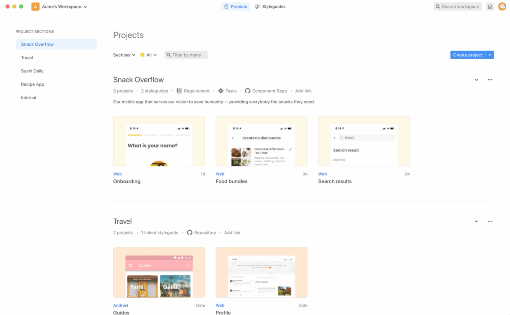
Modern UI design is supported by a powerful ecosystem of digital tools that help designers create, test, and collaborate on stunning interfaces. Here are some of the most widely used tools in the field:
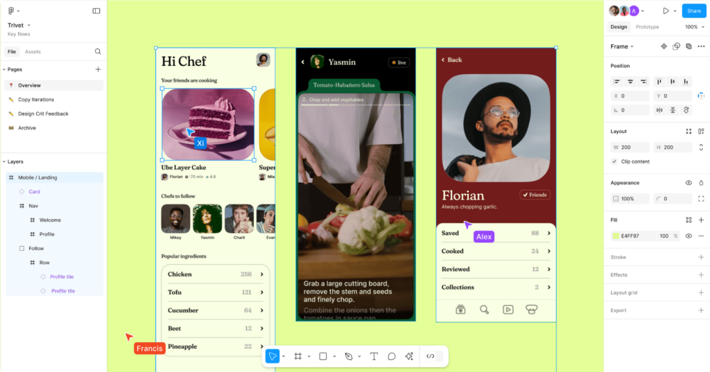
Figma is a powerful, cloud-based UI design and prototyping tool that has revolutionized how teams collaborate on design projects. Unlike traditional desktop applications, Figma allows multiple users—including designers, developers, product managers, and stakeholders—to work on the same design file simultaneously in real-time, no matter where they are in the world.
It supports interactive prototyping, vector editing, shared component libraries, and full design systems. Figma’s browser-based access eliminates the need for installations or updates and offers seamless integration with tools like Slack and Jira. Its intuitive interface, version history, and team-friendly features have made it a top choice for agile teams and remote design collaboration.

Adobe XD is Adobe’s flagship tool for UI/UX design, offering a smooth, professional experience for creating wireframes, prototypes, and high-fidelity interfaces. It stands out for its deep integration with other Adobe Creative Cloud products like Photoshop and Illustrator, allowing designers to bring in rich assets and visual elements with ease.
Adobe XD supports responsive design, voice interactions, and auto-animations, making it suitable for everything from websites to mobile apps. Designers can create interactive click-through prototypes and share them with teams or clients for testing and feedback. It’s a particularly strong tool for teams already familiar with the Adobe ecosystem who need power, precision, and polish in one interface.
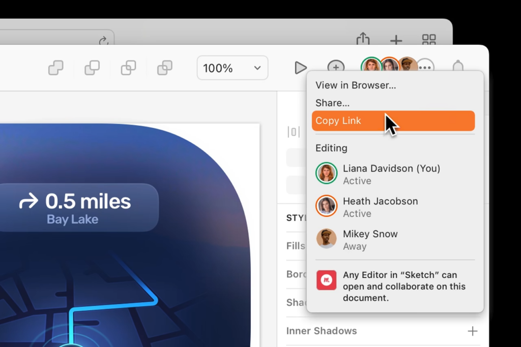
Sketch is a vector-based UI design tool designed specifically for macOS, and it remains a favorite for digital product designers due to its simplicity, performance, and strong community support. Known for its clean interface and intuitive workflow, Sketch is especially effective for creating scalable design systems and reusable UI components.
With a vast library of third-party plugins and integrations, Sketch allows for extensive customization and feature extension. It supports collaborative workflows through tools like Sketch Cloud and integrations with platforms like Zeplin or Abstract. While it’s not cloud-native like Figma, its focus on precision design makes it ideal for creating polished, detailed UI mockups and components.

InVision is a comprehensive design platform best known for its interactive prototyping capabilities. It allows designers to create clickable, animated prototypes that simulate real product experiences—without writing a single line of code. This makes it perfect for user testing, stakeholder reviews, and validating ideas early in the product lifecycle.
InVision also offers tools like Freehand (for whiteboarding and brainstorming), DSM (Design System Manager), and Inspect (for developer handoff). These tools help teams go beyond static design by enabling feedback, collaboration, and iteration across the entire product development process. It’s especially valued for its robust prototyping, presentation capabilities, and support for remote design workshops.
Zeplin acts as a powerful bridge between design and development teams. Once the UI designs are ready, Zeplin transforms them into developer-friendly specs, complete with measurements, color codes, fonts, and assets. Developers can then export everything they need without having to dive into the design files directly.
By generating style guides and code snippets automatically, Zeplin eliminates guesswork and reduces miscommunication between designers and developers. It supports seamless integration with Figma, Adobe XD, Sketch, and various dev tools like VS Code, Jira, and Slack. For teams looking to maintain design consistency and streamline the design-to-code workflow, Zeplin is an invaluable tool.
Conclusion
User interface design is no longer optional, it’s a key business driver. From shaping first impressions to improving engagement, UI has the power to elevate your digital product from average to exceptional.
Whether you’re building a new product or optimizing an existing one, partnering with experts like Enozom.com ensures your UI delivers clarity, beauty, and performance.