The design of a website can significantly influence a customer’s purchasing decision. As we step into 2024, the standards for web design continue to evolve, with businesses striving to create visually appealing, user-friendly, and highly functional websites. The best eCommerce websites not only showcase their products beautifully but also provide an intuitive and engaging user experience that keeps customers coming back. This article highlights 25 eCommerce websites that excel in design, demonstrating the latest trends and innovations that set them apart in 2024. Whether you’re looking for inspiration or aiming to understand the elements that contribute to successful eCommerce websites, these examples offer a wealth of ideas and best practices.

Apple’s eCommerce site is a masterclass in minimalism and functionality. The clean layout, ample white space, and high-quality product images create an engaging and immersive shopping experience. The intuitive navigation ensures users can easily find what they’re looking for.
Apple’s product pages are detailed, featuring not only high-resolution images but also comprehensive technical specifications, customer reviews, and comparison tools that aid in making informed purchase decisions. The integration of seamless animations and transitions adds to the overall user experience without overwhelming the visitor.
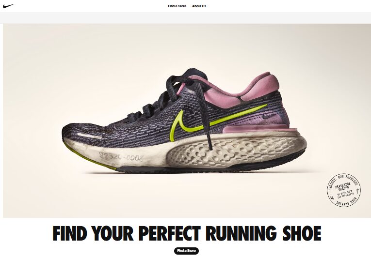
Nike’s website combines bold visuals with interactive elements. The dynamic homepage features high-resolution videos and images that showcase the brand’s latest products and innovations.
The customization options, such as the “Nike By You” feature, enhance user engagement. Nike also excels in storytelling, using compelling narratives and athlete endorsements to connect with customers emotionally.
Their site is optimized for performance, ensuring quick load times even with rich media content, and it offers a personalized shopping experience with product recommendations based on user behavior and preferences.
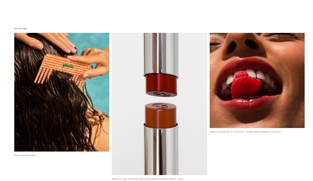
Glossier’s site is known for its sleek, modern design that aligns perfectly with its brand identity. The use of pastel colors, simple typography, and user-generated content creates a community-driven shopping experience. The product pages are detailed yet uncluttered, focusing on key features and benefits.
Glossier also integrates social proof effectively, showcasing customer reviews and photos, which help build trust. The site’s mobile experience is equally impressive, maintaining the same level of aesthetic appeal and functionality as the desktop version, making it accessible and user-friendly on all devices.

Warby Parker excels in combining functionality with aesthetics. The site’s clean design and straightforward navigation make it easy for users to browse eyewear collections.
The virtual try-on feature using augmented reality adds a unique, personalized shopping experience. Warby Parker also provides extensive information on each product, including detailed descriptions, customer reviews, and a virtual assistant to help users choose the right pair.
Their commitment to accessibility is evident through features like adjustable font sizes and screen reader compatibility, ensuring an inclusive shopping experience for all users.
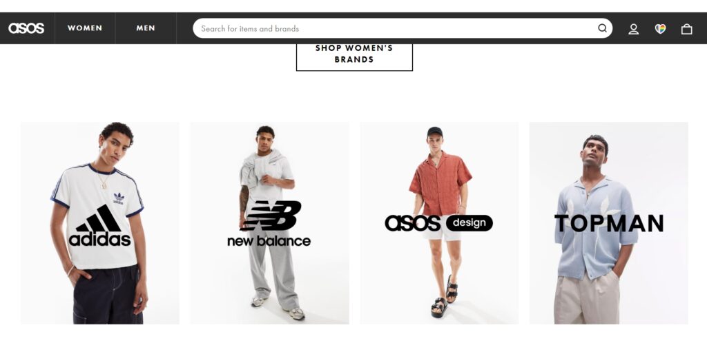
ASOS’s eCommerce platform is designed for a seamless shopping experience, especially on mobile devices. The extensive use of filters, user reviews, and detailed size guides help customers make informed purchasing decisions.
The vibrant and youthful design appeals to its target audience. ASOS also features a robust recommendation system that suggests products based on browsing history and preferences, enhancing the personalization of the shopping experience.
The integration of social media elements, such as shoppable Instagram posts, helps bridge the gap between social engagement and eCommerce.
6. Everlane
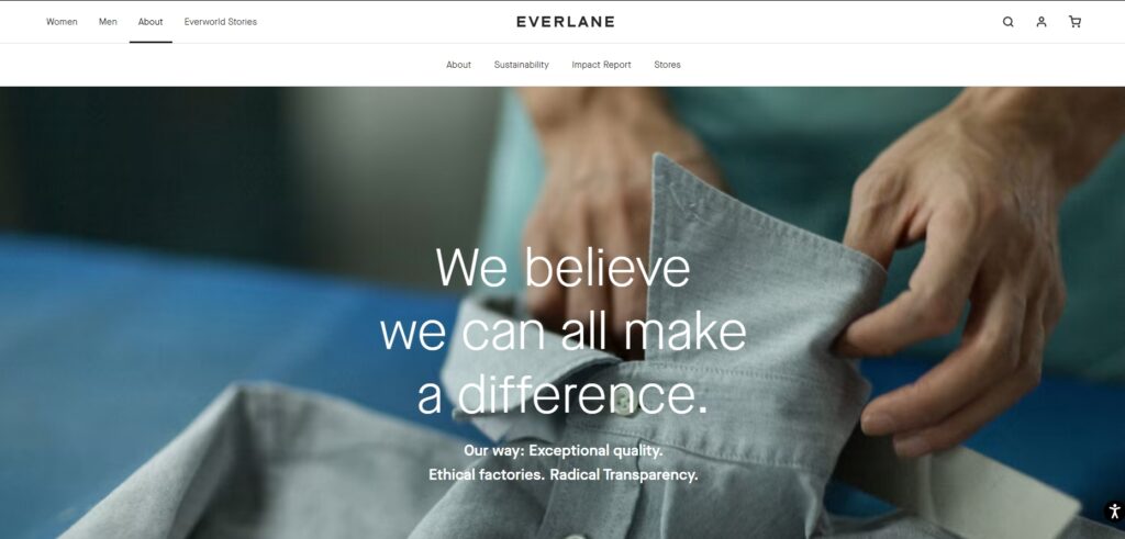
Everlane’s website emphasizes transparency and simplicity. The clean, minimalist design is complemented by detailed product descriptions and high-quality images.
The “Choose What You Pay” feature highlights the brand’s commitment to ethical consumerism. Everlane also provides extensive information about their supply chain, materials used, and the factories they partner with, fostering trust and loyalty among customers.
Their design choices reflect their brand values, focusing on sustainability and ethical practices, which resonate well with their target audience.
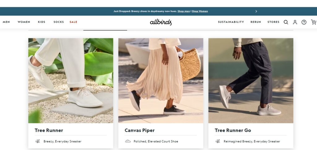
Allbirds’ site focuses on sustainability and comfort, reflected in its design. The clean, eco-friendly aesthetic, combined with storytelling elements about the materials used, enhances the brand’s appeal. The easy-to-navigate layout and clear calls-to-action improve user experience.
Allbirds also offers a seamless checkout process with minimal steps, reducing friction and enhancing conversion rates. Their use of high-quality images and detailed product pages that highlight the unique features of their products, such as material origins and environmental impact, provides a comprehensive shopping experience.
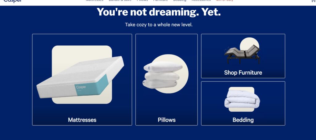
Casper’s eCommerce site uses a soothing color palette and clean design to reflect its brand ethos of comfort and rest. Interactive elements, such as quizzes to find the perfect mattress, and detailed product pages enhance the shopping experience.
Casper also features informative content like sleep guides and tips, which add value for visitors and position the brand as an expert in sleep health. The site’s design encourages exploration, with intuitive navigation and engaging visuals that keep users engaged and informed.
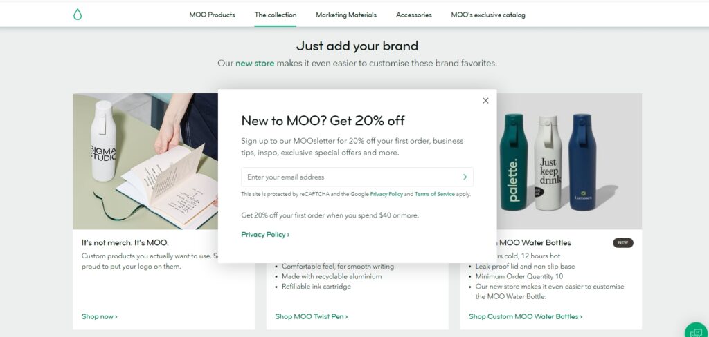
Moo’s website design is a perfect blend of creativity and functionality. The use of vibrant colors and high-quality images showcases their printing products effectively. The user-friendly customization tools and clear, concise product descriptions make for an enjoyable shopping experience.
Moo also offers interactive previews of customized products, allowing users to see exactly what they will receive before making a purchase. The site’s professional yet playful aesthetic appeals to a broad audience, from small business owners to corporate clients.
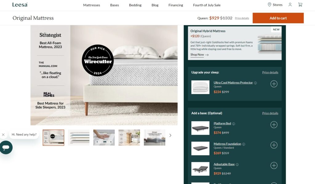
Leesa’s site features a clean, modern design with a focus on simplicity. The homepage highlights the brand’s core products with beautiful imagery and concise information. The use of customer testimonials and detailed product pages helps build trust and credibility.
Leesa also provides an easy-to-navigate interface, ensuring users can quickly find the information they need. The inclusion of informative videos and comparison charts helps potential customers understand the benefits of Leesa mattresses, aiding in the decision-making process.
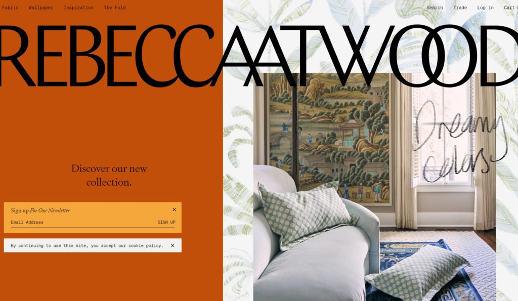
Rebecca Atwood’s eCommerce site is a visual delight with its artistic and elegant design. The use of soft colors and beautiful patterns reflects the brand’s aesthetic. The well-organized layout and detailed product descriptions make browsing a pleasant experience.
The site also features a blog that provides insights into design trends and tips, adding value and engaging visitors. Rebecca Atwood’s site excels in showcasing the brand’s unique products through high-quality images and storytelling elements that highlight the inspiration behind each collection.
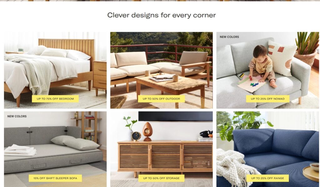
Burrow’s website stands out with its modern and functional design. The use of interactive elements, such as a sofa customization tool, enhances user engagement. The clean layout and clear calls-to-action make the shopping process straightforward.
Burrow also offers extensive product information, including detailed dimensions, materials, and assembly instructions, which help customers make informed decisions. The site’s design reflects the brand’s commitment to simplicity and innovation, providing a hassle-free shopping experience.
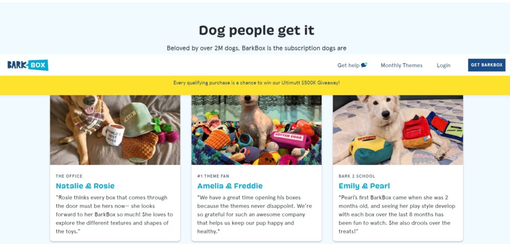
BarkBox’s playful and engaging website design reflects its brand personality. The use of bright colors, fun graphics, and user-generated content creates a community feel. The subscription model is clearly explained, making it easy for customers to sign up.
BarkBox also features a blog and social media integration, fostering a sense of community among pet owners. The site’s interactive elements, such as quizzes to personalize the subscription, enhance user engagement and make the shopping experience enjoyable.
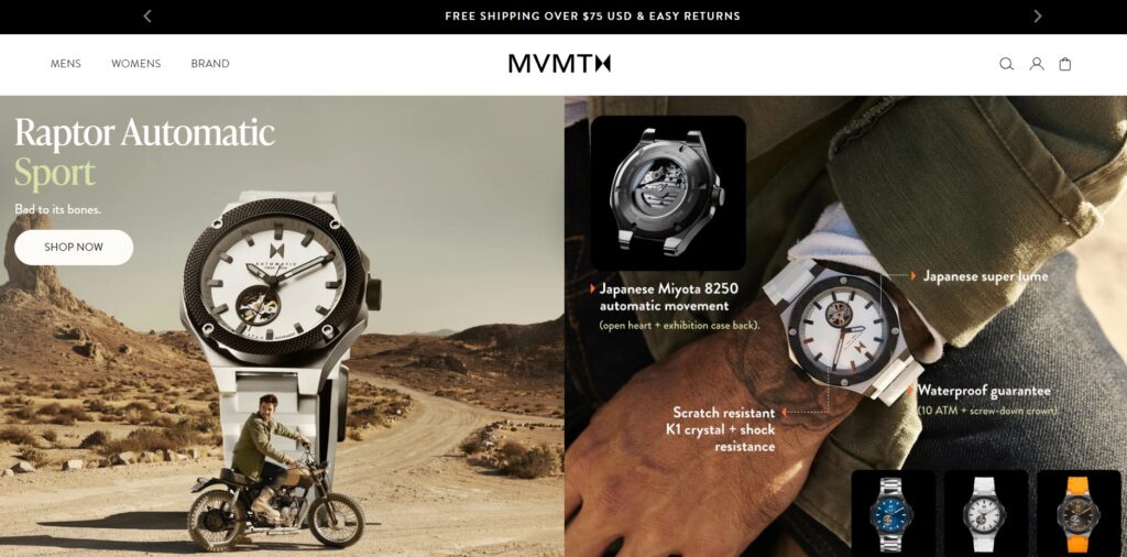
MVMT’s eCommerce site features a sleek, minimalist design that highlights its stylish watches and accessories. High-quality images, clean typography, and an intuitive navigation system make for a seamless shopping experience.
MVMT also incorporates user-generated content and customer reviews, which add authenticity and help build trust. The site’s detailed product pages, complete with high-resolution images and comprehensive descriptions, ensure customers have all the information they need to make informed purchases.
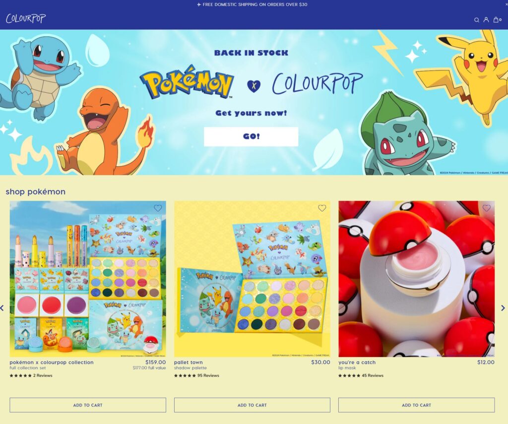
ColourPop’s website is vibrant and colorful, reflecting its brand identity. The use of high-quality product images, user-generated content, and clear, detailed product descriptions helps customers make informed decisions. The site’s layout is user-friendly, with easy navigation and quick load times.
ColourPop also features a robust search functionality and filtering options, allowing users to quickly find the products they are looking for. The integration of social media elements, such as customer photos and reviews, enhances the overall shopping experience.
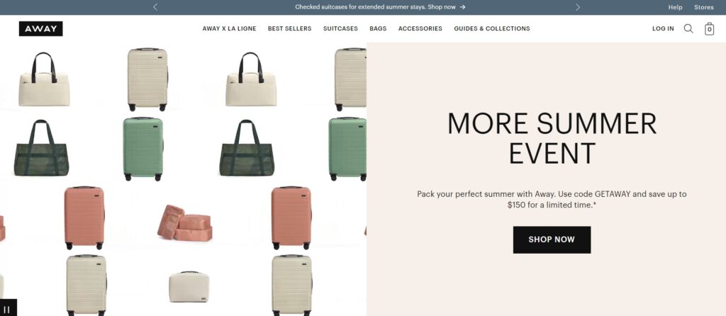
Away’s eCommerce site combines minimalism with functionality. The clean design and ample white space focus attention on the products. The detailed product pages, with high-quality images and informative videos, provide a comprehensive shopping experience.
Away also offers a seamless checkout process and excellent customer support, ensuring a smooth shopping journey. The site’s travel-related content, such as packing tips and destination guides, adds value and engages visitors, positioning Away as more than just a luggage brand.
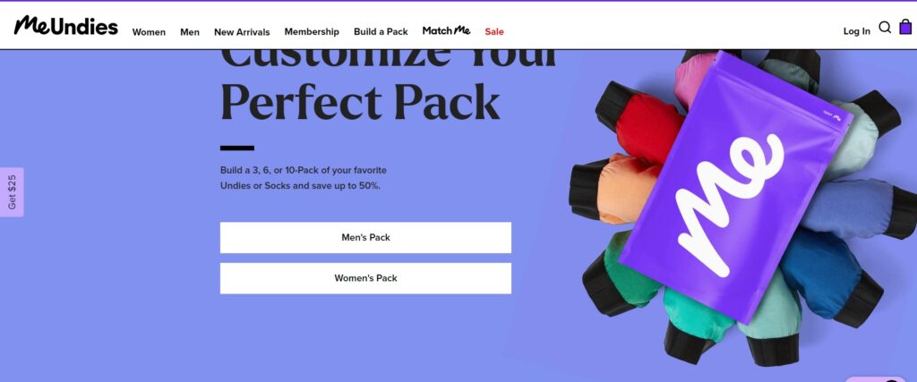
MeUndies’ website design is playful and modern, with a focus on comfort and style. The use of bold colors, fun graphics, and interactive elements enhances the shopping experience. Detailed product descriptions and customer reviews provide valuable insights for shoppers.
MeUndies also features a subscription model, clearly explained and easy to manage, which helps build customer loyalty. The site’s design reflects the brand’s fun and approachable personality, making it a favorite among its target audience.
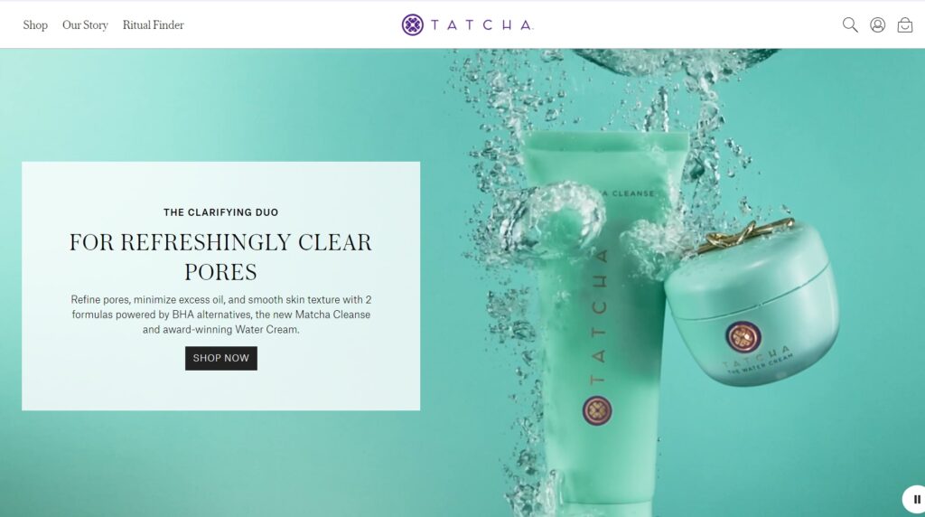
Tatcha’s site features a luxurious design that reflects its high-end skincare products. The use of elegant typography, high-quality images, and detailed product descriptions create an immersive shopping experience. The site is well-organized, making it easy for users to find what they need.
Tatcha also offers extensive educational content, such as skincare guides and product usage tips, which add value for customers and position the brand as an expert in skincare. The site’s design and content work together to create a sense of luxury and exclusivity.
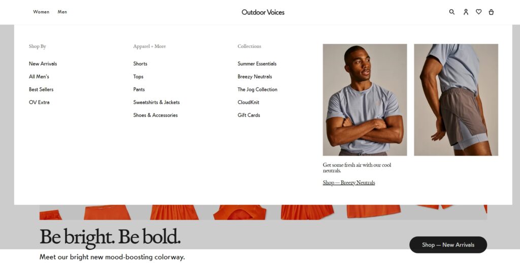
Outdoor Voices’ eCommerce site is fresh and modern, with a focus on activewear. The use of bright colors, dynamic images, and clear calls to action enhances the shopping experience. The detailed product pages and customer reviews help build trust and credibility.
Outdoor Voices also features community-driven content, such as user-generated photos and stories, which foster a sense of belonging and encourage a vibrant community spirit. The site’s design reflects the brand’s commitment to promoting an active and healthy lifestyle, making it appealing to fitness enthusiasts.
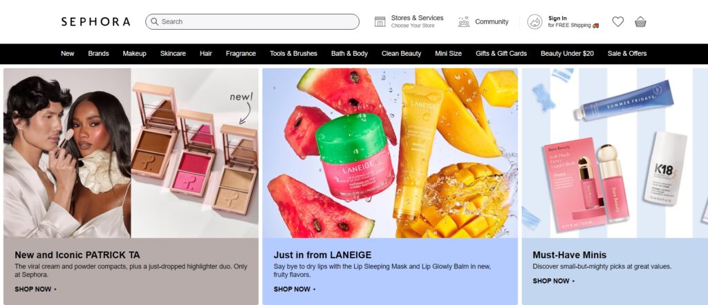
Sephora’s website is a benchmark in eCommerce design, combining rich visuals with user-friendly features. The use of high-quality images, detailed product descriptions, and user reviews makes for an engaging shopping experience. The virtual try-on tool and personalized recommendations add a unique touch.
Sephora also integrates various content elements such as video tutorials and beauty guides, which help educate customers about products and application techniques, enhancing their shopping experience.
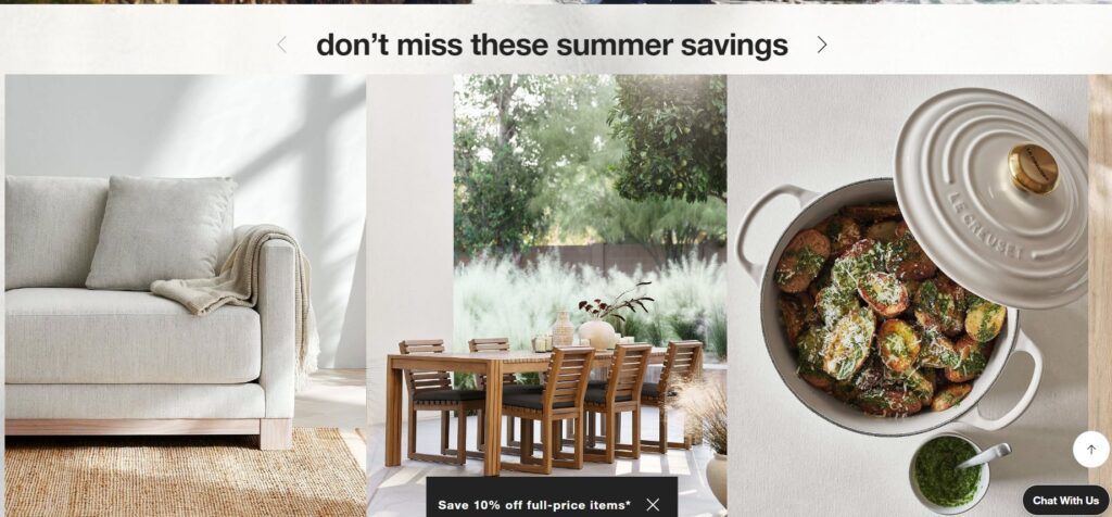
Crate & Barrel’s eCommerce site features a clean, modern design that highlights its home goods products. The use of high-quality images, detailed product descriptions, and customer reviews helps shoppers make informed decisions. The site’s layout is intuitive, making it easy to navigate.
Crate & Barrel also offers design inspiration and room planning tools, which provide added value and help customers visualize how products will fit into their spaces, fostering a more engaging and practical shopping experience.
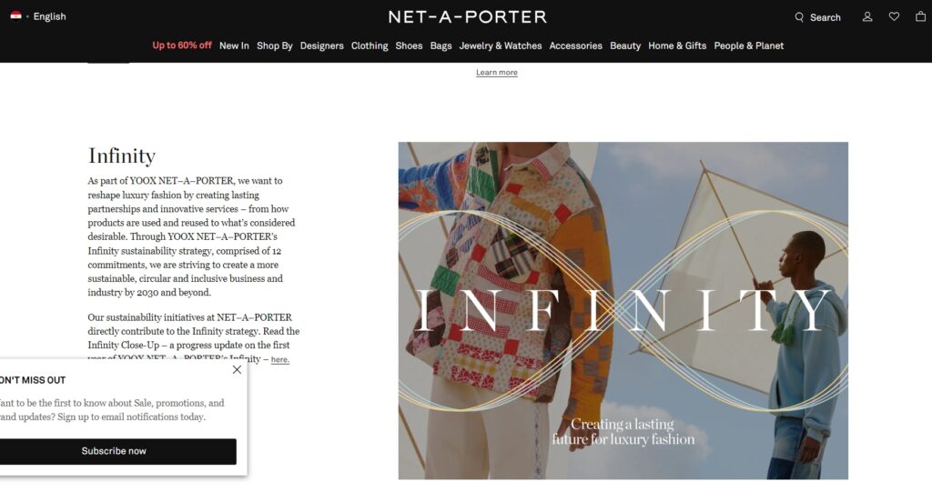
Net-a-Porter’s is one of the eCommerce websites which exudes luxury and sophistication. The use of high-quality images, elegant typography, and detailed product descriptions creates an upscale shopping experience. The personalized recommendations and editorial content add a unique touch.
Net-a-Porter also features a digital magazine and style guides, offering fashion advice and trends, which position the brand as a thought leader in the luxury fashion industry and provide a richer shopping experience.
23. ModCloth
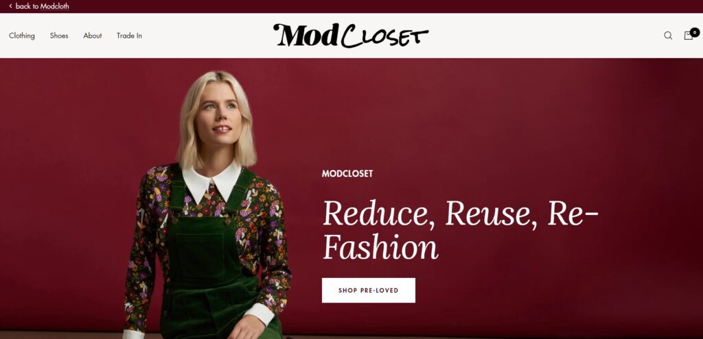
ModCloth’s site is known for its retro and vintage-inspired design. The use of bright colors, fun graphics, and user-generated content creates a community-driven shopping experience. The detailed product pages and customer reviews provide valuable insights for shoppers.
ModCloth also offers styling advice and fit guides, helping customers choose the right products and encouraging them to explore different fashion styles, which enhances the overall shopping journey.
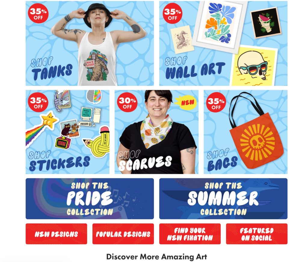
Threadless’ website features a creative and engaging design that reflects its artist-driven marketplace. The use of vibrant colors, high-quality images, and interactive elements enhances the shopping experience. The well-organized layout and detailed product descriptions make browsing a pleasure.
Threadless also fosters a community of artists by showcasing their work and stories, creating a platform that not only sells products but also promotes artistic expression and community engagement.
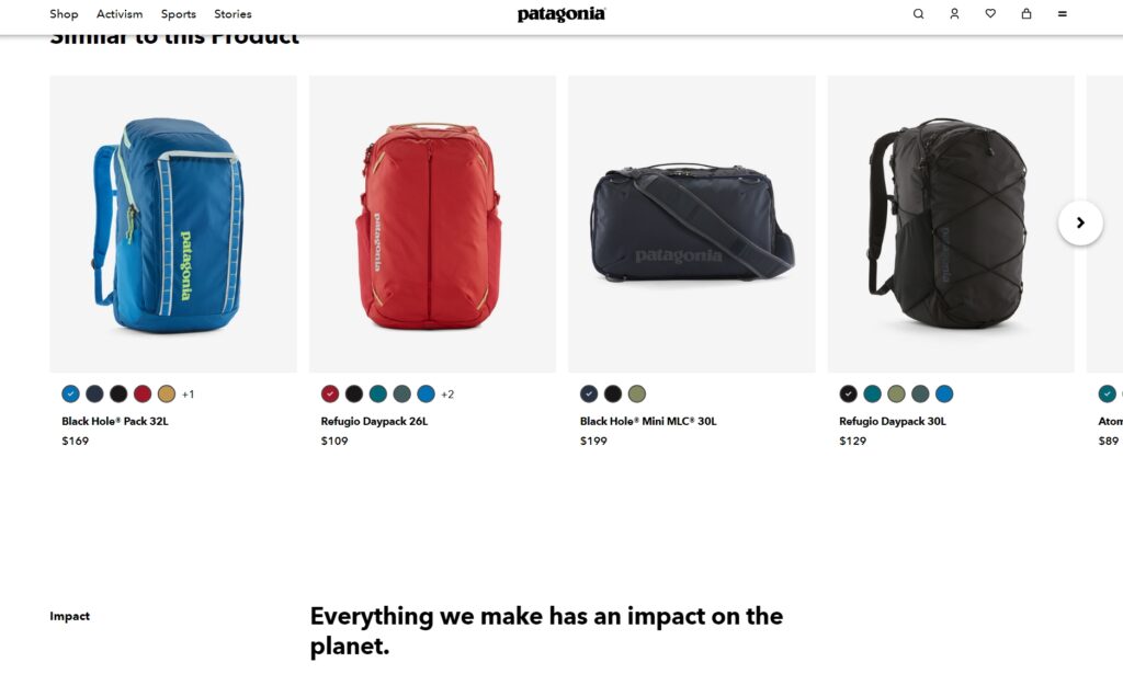
Patagonia is one of the eCommerce websites which combines functionality with sustainability. The clean design and ample white space focus attention on the products. The use of high-quality images, detailed product descriptions, and customer reviews helps build trust and credibility. The site’s layout is intuitive, making it easy for users to find what they need.
Patagonia also emphasizes its commitment to environmental responsibility, providing information about its sustainable practices and initiatives, which resonate with eco-conscious consumers and enhance brand loyalty.
Conclusion
As we move into 2024, eCommerce websites continue to evolve, with innovative designs that enhance user experience and engagement. The 25 examples highlighted above showcase the best in eCommerce websites design, combining aesthetics with functionality to create compelling shopping experiences. Whether through minimalism, bold visuals, interactive elements, or personalized features, these sites set the standard for what eCommerce websites can achieve. For businesses looking to improve their online presence, drawing inspiration from these examples can provide valuable insights into creating an outstanding eCommerce websites.

